Eye-Surgery Landing Page
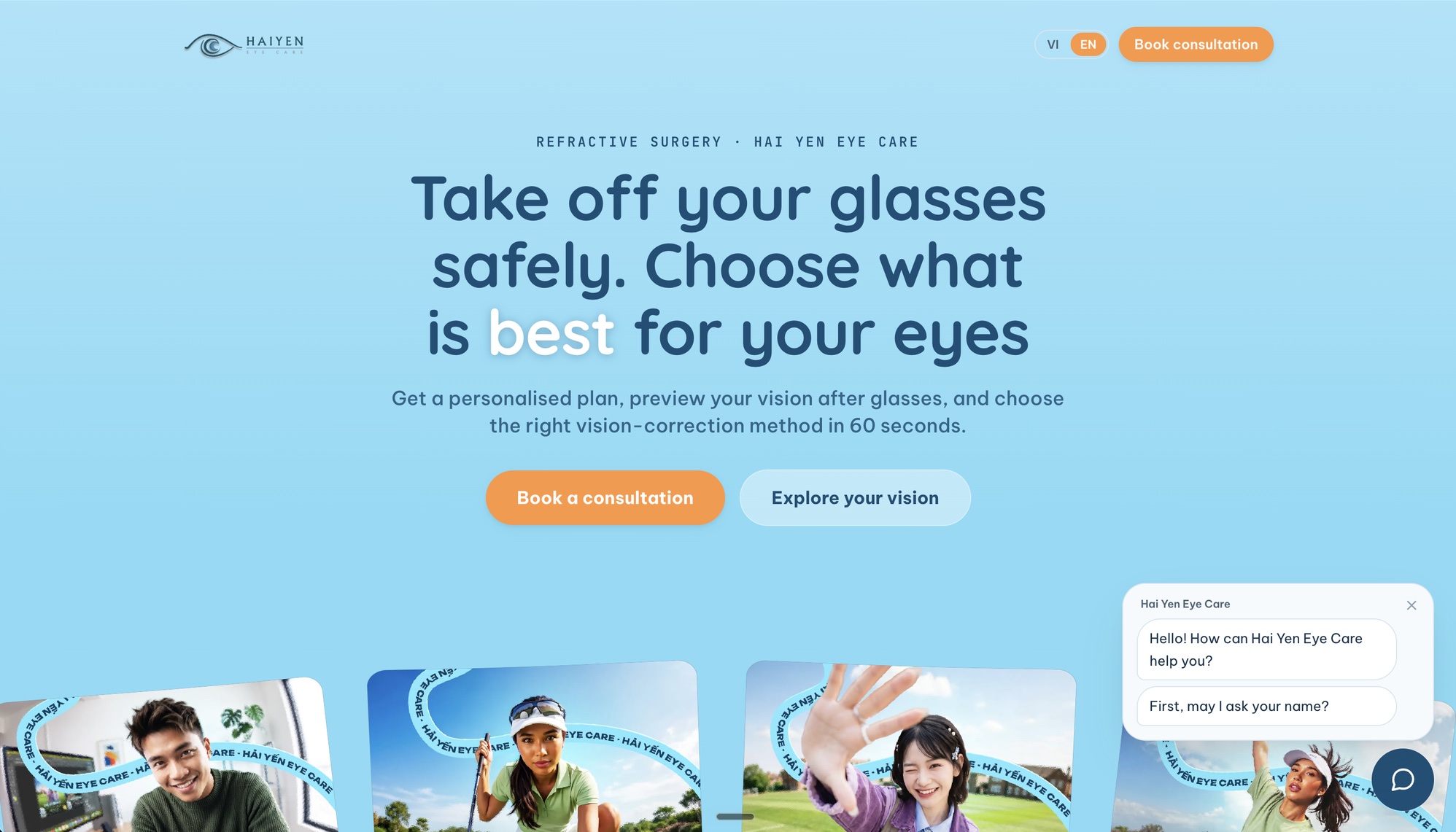
A Vietnamese-first landing page that turns paid ad clicks into surgery enquiries. It has one job, which is capturing a name and a phone number. The interesting part is that it earns that by showing you what your eyesight actually looks like, and by working out which of five procedures you're a candidate for before you ever pick up the phone.
The Problem
The clinic was buying ads for vision-correction surgery and sending that traffic to generic pages. Two things were going wrong.
They offer five different procedures, and nobody arriving from an ad has any idea which one applies to them. So people didn't say no, they stalled, which is worse because you've already paid for the click.
And the value was abstract. Telling someone you can fix their myopia means nothing if they've been at minus six since they were twelve. They can't picture the difference, so there's nothing to want.
On top of that the commercial constraint is brutal. The audience is 18 to 35, almost entirely on phones, on Vietnamese 4G. Every 100ms of load and every extra form field is ad spend set on fire.
The Decisions
- 01
The toys are a qualification funnel
Two interactions carry the page. A blur simulator where you set your own prescription and watch half a real photograph degrade to match it. And a matcher that takes your dioptre plus two yes or no questions and tells you which procedures fit. They look like engagement features. They're actually doing sales work. Both write to shared state, so the enquiry form arrives pre-filled with the procedure you matched, and the clinic's team opens a lead that already has the prescription and the shortlist on it. They start the call knowing the answer instead of asking for it.
- 02
Never hide an option, rank it instead
All five procedures are always on screen, in the same order, whatever you enter. Fit is shown as a status on each card: top, recommended, maybe, or not suitable. The obvious build is to filter the list down to what fits. I didn't, because hiding options makes people suspicious and a short list reads like a sales trick. Showing all five and ranking them makes the same point and leaves the visitor feeling informed. It always resolves to exactly one clear first choice, so nobody lands on an ambiguous result and stalls again.
- 03
The blur curve is tuned, not linear
The blur maps to your prescription on a curve rather than straight off the slider. A linear map is technically defensible and feels wrong: it under-sells mild myopia and over-sells severe. It's also just a CSS filter driven by one number, so there's no canvas and no library, and it stays cheap on a mid-range phone. And it prints a plain-language reference next to the figure, because almost nobody knows what their dioptre number means in the real world.
- 04
A lead is written down twice before it's confirmed
The form posts to a route handler, which mirrors the lead to a spreadsheet first and then forwards it to the CRM. The mirror is best-effort with a short timeout and every error swallowed, so a slow write can never affect the person submitting. The route also treats an explicit rejection from the CRM as a failure, not just a bad status code. Without that the form can show a success screen for a lead that was silently dropped, which is the sort of bug that quietly kills a campaign's return for a month before anybody notices. This is the only part of the page whose failure costs real money, so it's the part with redundancy.
- 05
The heavy things don't load until you ask for them
The page carries a WebGL gallery, four self-hosted videos, four embeds and three interactive tools, and it still had to load fast on 4G. So every embed is a facade. Posters render, and the real player only mounts on click, which means around 25MB of video is never downloaded by someone who bounces. The animated CTA band pulls in a large motion runtime, so it's split into its own chunk and only requested once an observer says it's near the viewport. It renders its first phrase as plain server-side text and upgrades in place, so it's never empty and never shifts.
- 06
I took the scroll-jacking out of the hero
The 3D hero gallery started as an open-source component. It hijacked page scroll through a window-level wheel listener. On a paid-ads page that's a conversion killer: someone swipes to get to the form and the page fights them. So the listener came out, the touch handling became axis-aware so a vertical swipe still scrolls, and it pauses when the tab is hidden or it's off screen. The hero copy stays real text above the canvas, because nothing inside WebGL is readable by Google or a screen reader.
What Shipped
One page, in Vietnamese and English, with the form right under the hero. It used to be at the bottom.
Two fields to submit
Just a name and a phone number. The best time to call came later, when leads stopped picking up.
A matcher with real clinical logic
A thin cornea rules out flap-based lasers. It never tells anyone they're eligible. The doctors do that.
Built for more than one campaign
One token layer, and a typed translation dictionary, so a missing string fails the build.
Accessible by default
Everything works by keyboard and touch, and every animation honours reduced motion.
- Next.js 16
- React 19
- TypeScript
- Tailwind v4
- OGL
- Radix UI
- Motion
- Vercel
- Next.js 16
- React 19
- TypeScript
- Tailwind v4
- OGL
- Radix UI
- Motion
- Vercel

Where It Is Now
Live and running paid traffic from four ad platforms, all tracked through one tag container so a new pixel doesn't need a code change. Every lead carries its campaign parameters and the full landing URL, so the clinic can tell exactly which ad produced it.
90 commits and 22 merged pull requests over about four weeks. A good chunk of that history is copy passes from the marketing team: pulling every free claim, taking published prices off, dropping a procedure from the list, standardising how the brand name is written. That's what the typed dictionary was for. Those changes stayed one-line edits the whole way through.